Top Ten Indicators It’s Time to Rebrand
November 29, 2017


Rebranding is a major investment in both time and money.
by Maureen McCabe
In Part 3 of our 10th Anniversary blogs, you will learn when it’s time to rebrand and why McCabe Marketing had to rebrand.
Your brand is more than your logo; it is your company’s identity. It represents your values, ideals, characteristics and personality traits, in other words, who you are and what you stand for. Your brand should also be the foundation for your marketing, your key messages and your communication strategies. Remember that your brand is more than just your logo.
Some brands are able to stay relatively consistent for a lifetime. Others want to refresh their brand with a tweaked logo. While other companies have changed their logo multiple times such as Starbucks, Coca-Cola, Pepsi, The Royal Bank of Canada, McDonald’s and Walmart, their brand corporate identity remained the same.
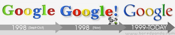
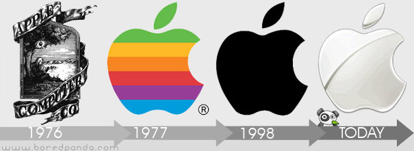
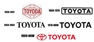
The following images do not show each version of the logo but a cursory evolution from the early days to the present. Images are courtesy of boredpanda.com. (*) Read to the end of the blog for links to each company’s logo history.

The following are examples of why companies rebrand:
- Your mission or values have changed.
- There is a new business owner, partner or leader.
- Your competitor has rebranded.
- A new competitor is using a logo that is similar; you want yours to be distinctive.
- To emphasize and identify an expanded product line and/or service.
- To incorporate a merger with another company, the need for a new name and a new logo is required.
- Your services have changed and the old name or identifier no longer fits.
- Your logo looks aged and out-dated.
- The company name is kept but it moved to an initialism, which is not pronounced as a word, but rather you say the individual letters. Examples include International Business Machines became IBM, Royal Bank of Canada became RBC and Kentucky Fried Chicken became KFC.
- The business name was slightly modified from the original. Toyota was “Toyoda” originally, and was the founder’s surname.
TIP: Prepare your employees, clients, vendors and partners of your plans to change your brand by proactively updating them before you launch.
Milestone Anniversaries:
If you are celebrating a milestone anniversary you might want to change your tagline, logo or design a special one.
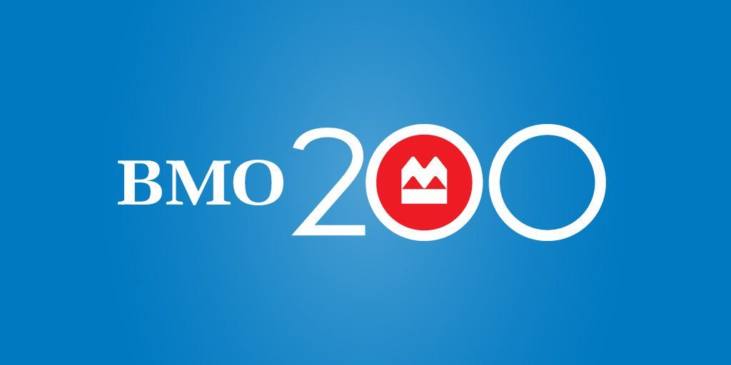
The Bank of Montreal, which many years ago moved to the initialism BMO, added the number “2” and second “0” to mark their 200th anniversary for 2017. It will be interesting to see if they continue to use it in 2018 and beyond. (Image credit, BMO website)
For our 10th anniversary we changed our tagline from Generate More Profits to 10 Years Exceeding Client Expectations.
Why did McCabe Marketing need to rebrand?
A few prospective male clients boldly stated that the brand had a “girly look,” not just with the colour pink but the curved “M” as well. When I spoke with a baker’s dozen, which was 13 clients, both males and females agreed. In fact, it was unanimous!
I recall Karen who delicately said, “Maureen, you are a professional. A new logo would convey a stronger brand, which would have greater appeal.” Her company had rebranded the previous year, so she understood the cost and value.
I had planned on rebranding in 2011, however, my rebranding initiative was a two-phase process that started unexpectedly in October 2010. Phase 1: The logo evolved
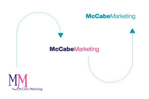
I needed a new logo for my video because during post-production when images are added, I discovered much to my chagrin that the logo was illegible. The rebranding process started in October 2010 with James Wilson, owner of Overdrive, a top-notch full-service branding, interactive and communications agency.
The middle logo was the transitional one that premiered in my first video. We maintained the original colours of fuchsia and deep purple because the logo had to be changed on the website as the homepage featured the video and I needed to be consistent – after all, I am a marketer. New business cards were printed to give the brand a cohesive look.
Phase 2: Rebranded
As teal had been one of the three colours used in my website, the colour provided brand consistency and it appealed to both genders.
In 2011, our brand premiered. Yes, I waited until everything was ready. The launch was simultaneously coordinated in one day with a brand-spanking-new website, which included six banners each with an original illustration (no stock art for me), four new videos, updated social media profiles and remarketing ads, plus stationery, business cards and more.
I love my logo; I never plan to rebrand again! Expect an updated tagline for the 15th anniversary;)
15 Years Exceeding Client Expectations.
Before launching your rebranding project ensure your strategy avoids the most common pitfalls. Book your free marketing brand assessment.
(*) At the beginning of this blog was a reference to each company’s corporate identity history. Check out these articles: Google, Volkswagen, Apple, and Toyota name and emblem history.
Like what you've read? Please share this article, here:
 Free Consultation
 Marketing Check-up
 Free Marketing Report
 Free SEO Template
 Make An Inquiry


